Cluck-Cluck Yeah!
ITERATIVE PROCESS
PACKAGE DESIGN &
BRAND IDENTITY SYSTEM
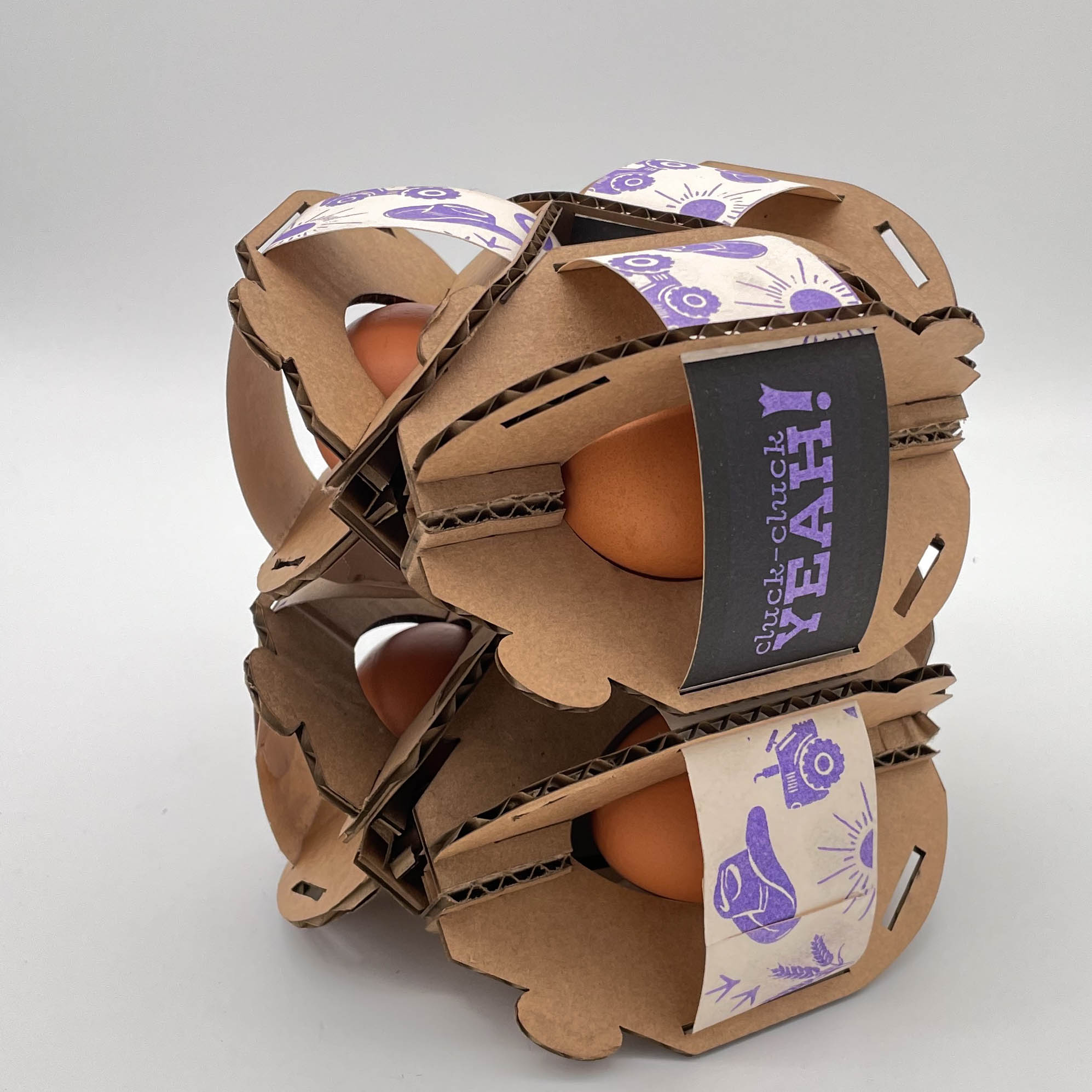
A take on a classic science class project, The Egg Drop, this package protects the egg from falls up to 6ft and can connect together, without adhesive or a separate carrier, up to 12 times. Am I choosing to show a highly impractical theoretical project as a main portfolio piece? Yes. Why? Because it illustrates an adaptable, modular packaging system with extreme attention to the security of a fragile product. Also, eggs are good for you.
All 12 packages for a dozen eggs can be cut out of a single sheet of cardboard.

The Wrap
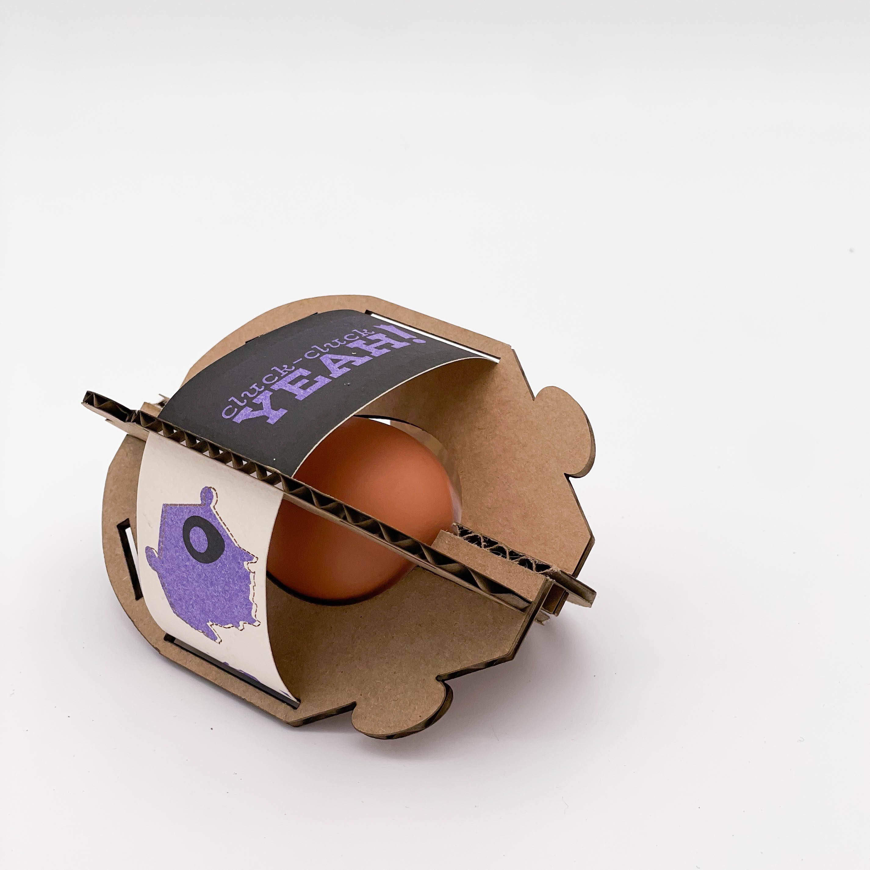
For ease of production and assembly, branding and information is printed on a paper wrap. Additionally, this wrap helps the cardboard box maintain its shape. Printed on 100% recycled paper and using a risograph machine, the wraps are sustainable and inline with Cluck-Cluck Yeah!’s brand values.
The riso color separations are shown below.
The riso color separations are shown below.


The Cluck-Cluck Yeah! single egg packaging design focuses on sustainability, ease of construction, and modular connectivity.


Identity & Icon System
Using a limited three color palette,
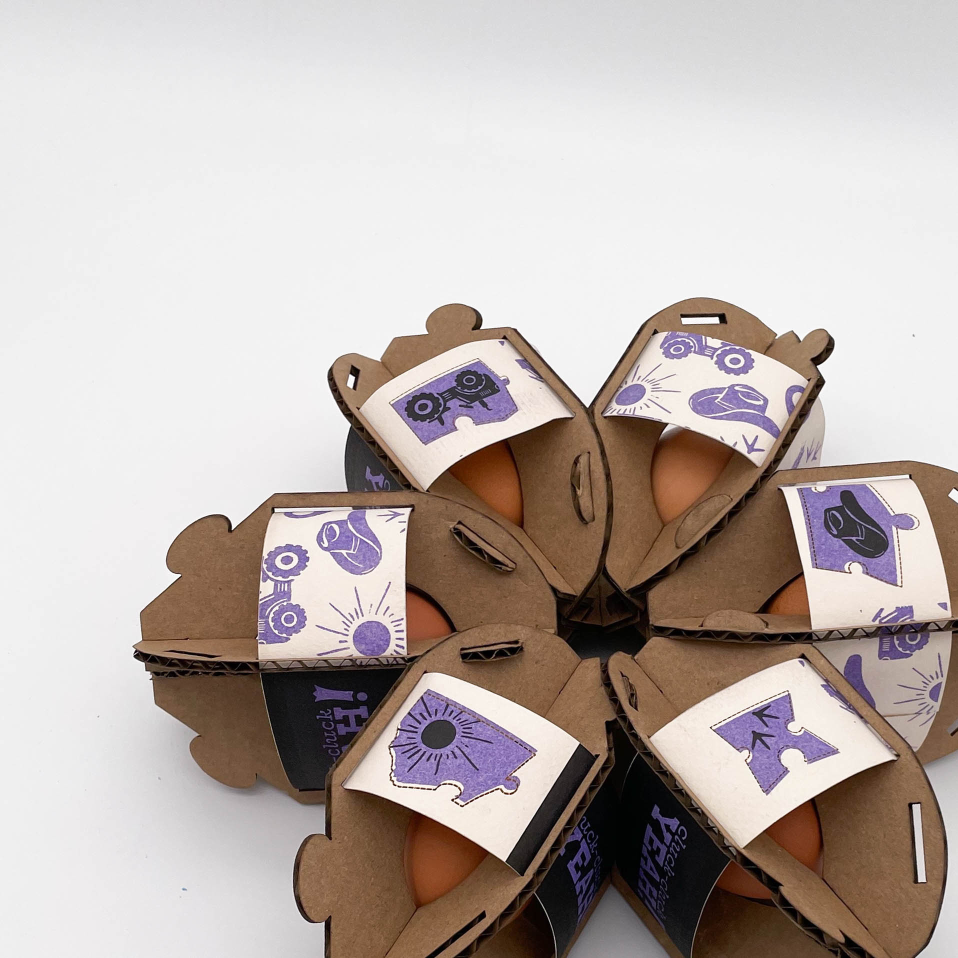
the brand system is simple and versatile. Referencing the construction of the packages, the puzzle piece icons form
the shape of Montana–– Cluck-Cluck Yeah!’s location is further emphasized by the
egg icon serving as a location marker over Bozeman. Additionally, the six icons combine to form a pattern. This system creates a clear brand identity while
being adaptable and modular.

The puzzle piece icons reference the way that the packages connect and highlights the modular nature of the brand.

